
Discover Inspirational Art In Many Forms of Multi media
My Acrylic and Oil Painting Process
The canvas types I use for all of my inspirational art are quality cotton and linen framed or panel canvases. I also use linen and cotton pads. All products I use are archival including Golden acrylic paint and Gamblin oil paint. I also use either Golden medium for acrylics to thin my paint or water. I use Gamsol to thin my paint or a medium to speed up the drying time.

Blending Brushstrokes
While I make brushstrokes, they are not as thick as those shown above. Parts of my paintings show blended paint, while other areas boast brusthstrokes. I use them to define parts of my paintings or color. However, I begin by choosing my palette and covering the canvas with an underpainting of acrylic paint.

A Celebration of Color
I choose colors that are bright, and that stand out from a distance. The acrylic wash is a highlight color. Next, I draw an outline of the scene or portrait in acrylic paint or pastel pencil. I use large brushes for much of the painting, and smaller for details. This helps me to capture the beauty and diversity of imagination.

First Layer Of Paint
I use the Acrylic paint for the foundation of the painting, and then I use oil paint to complete it. While I use a reference guide, but I don't always follow it exactly, except for custom work. This way I'm able to add spontaneous creative touches when I feel moved to do so rather than feeling tied to a specific scene.
More About My Process:
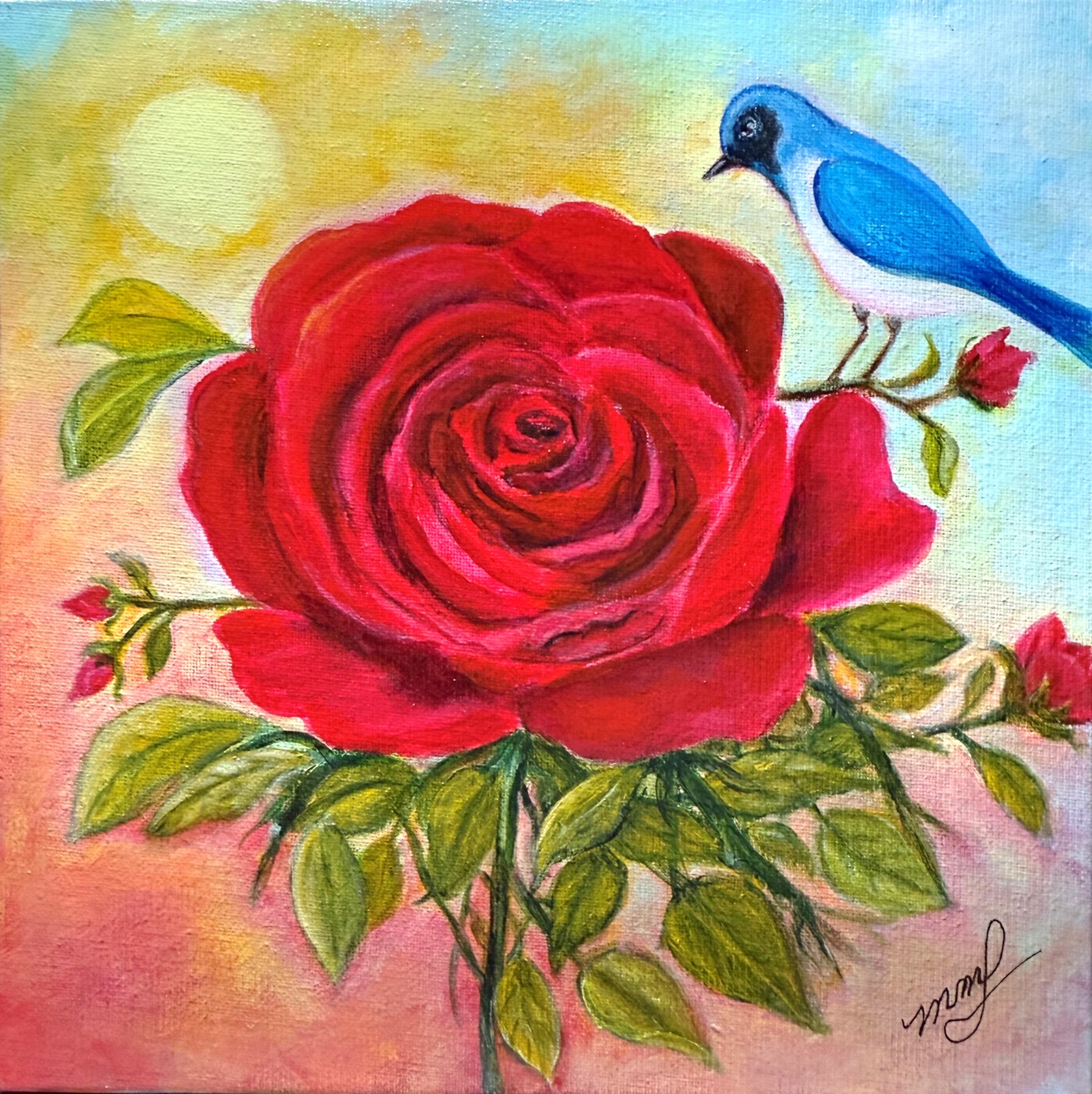
Acrylic Underpainting
I usually begin painting in acrylics and complete the work in oil. My favorite acrylic paints are Charvin and Golden. I will either begin painting in layers, or use acrylic spray paint, ink, markers, papers, etc. Once dry, I begin the painting leaving parts of the background showing through the layers. However, once I begin using oil paint, I never use anything acrylic because it can cause the oil to crack.
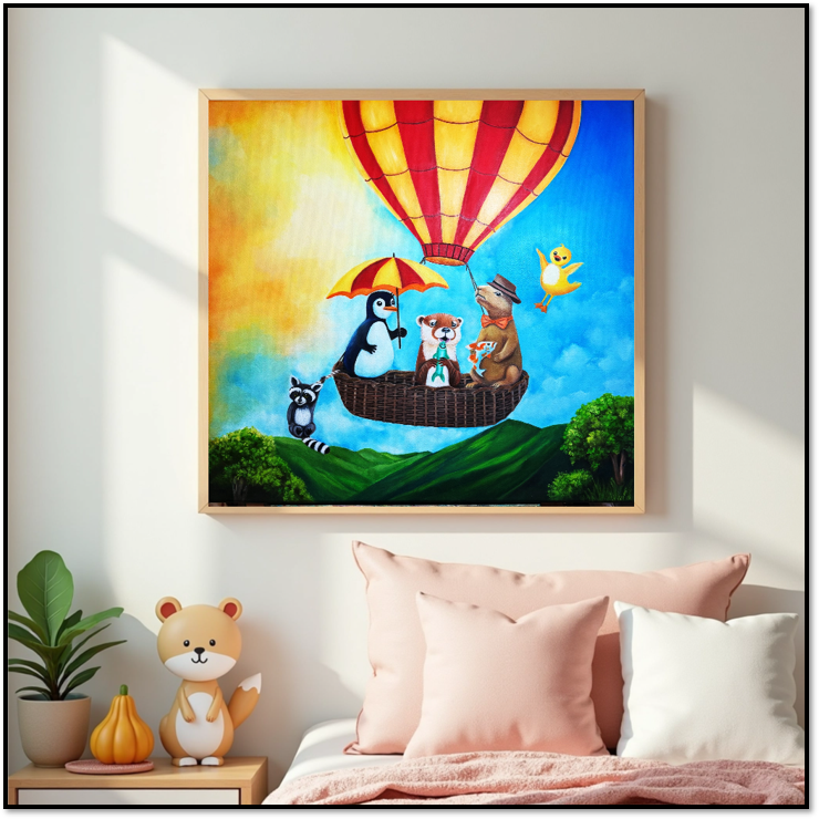
Custom Paintings
I rarely add multimedia elements to custom paintings such as the one above, which I designed and recently completed, unless I am requested to do so. I use my normal process of acrylic and oil unless I have a special request. I use images and photographs or whatever I'm given to paint a realism painting or an abstract piece. It all depends on the client.
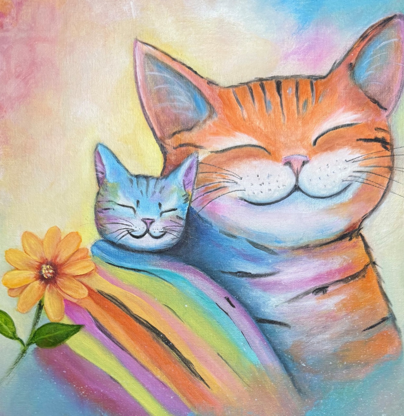
Drying and Varnishing
When the oil is dry on my paintings, I clean the surface with a Gamblin medium. I use the varnish finish that works best for the painting; gloss, satin or matte. I like to use a low gloss varnish for most of my paintings or a semi gloss. I also use gloss for small landscapes and whimsical paintings. I rarely sell my paintings with a frame, but there are times when a frame seems appropriate.
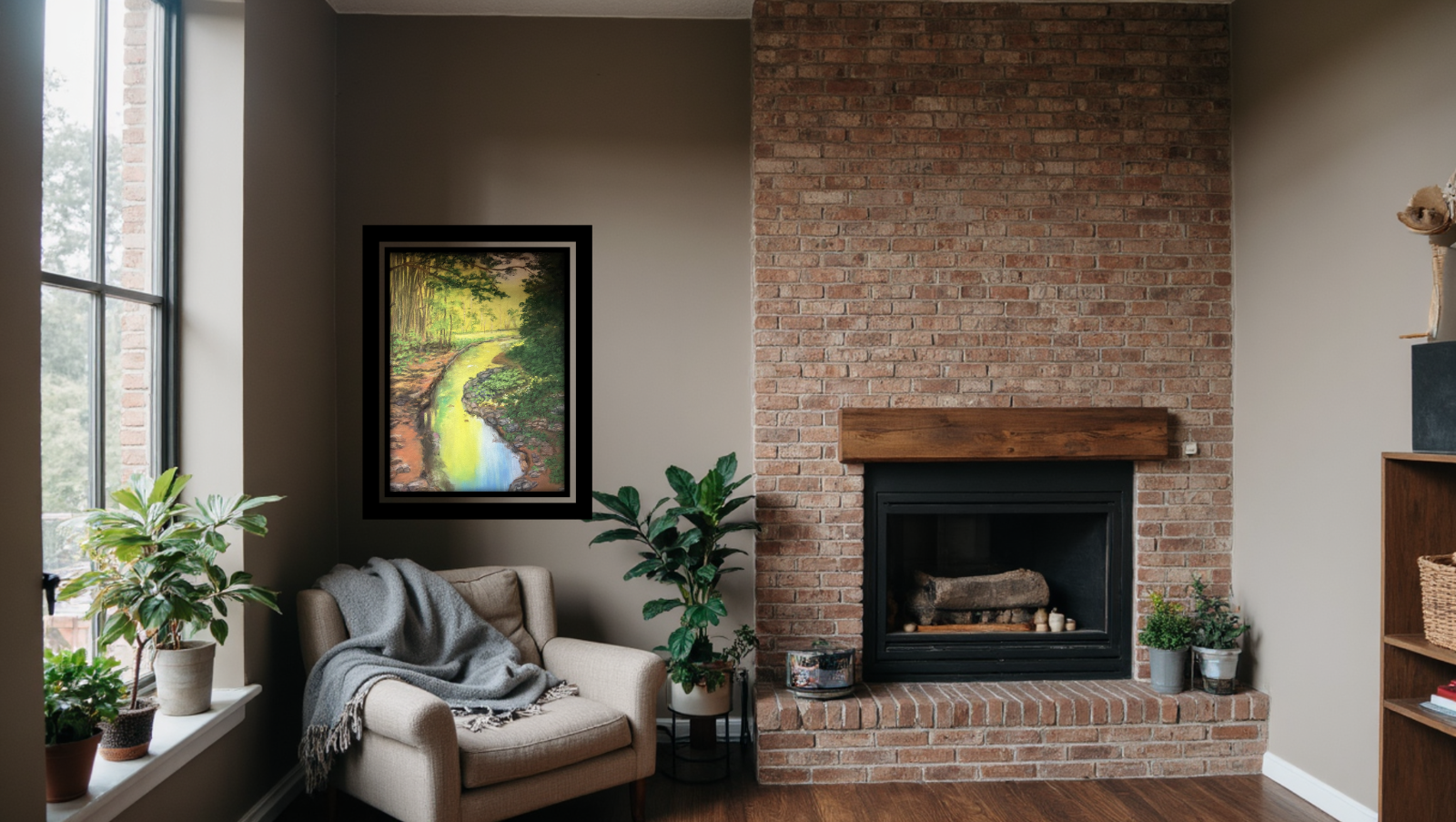
My Soft Chalk Pastel Painting Process
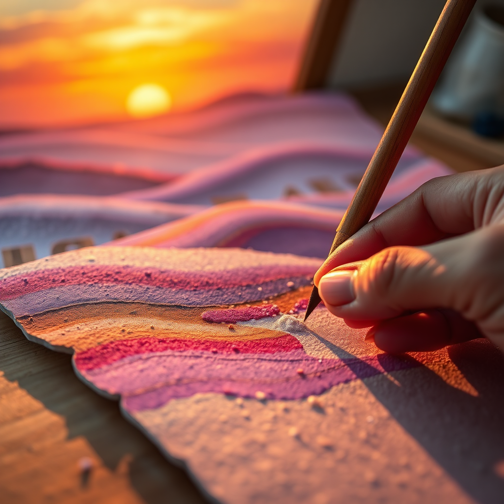
For the smooth painterly results I enjoy from this medium requires the use of a 5 or 6 grade sanded paper made specifically for the chalk pastels. While the paper is expensive, it yields what I feel are the best results, especially when using water or alcohol. Another purpose for using this paper is that I can paint 9 or 10 layers with great results. I can also use more layers to add various textures such as the strata effect for ground areas in landscapes ( see painting displayed above).
Soft Chalk Underpainting
I use soft chalk pieces, soft chalk pencils and Pan Pastels which all work together for the creation of my chalk paintings. My underpainting is a mixture of alcohol and pan pastels. I use a brush for application. The colors I use provide a nice effect throughout most of the painting.
A Celebration of Color
I choose my brightest colors for landscapes and portraits because dark colors appear too dark in a room when the lights are off with this medium. I want my chalk paintings to be bright. For custom portraits I use the colors shown in the images given me unless otherwise stated. When complete it's ready to frame.
Completion
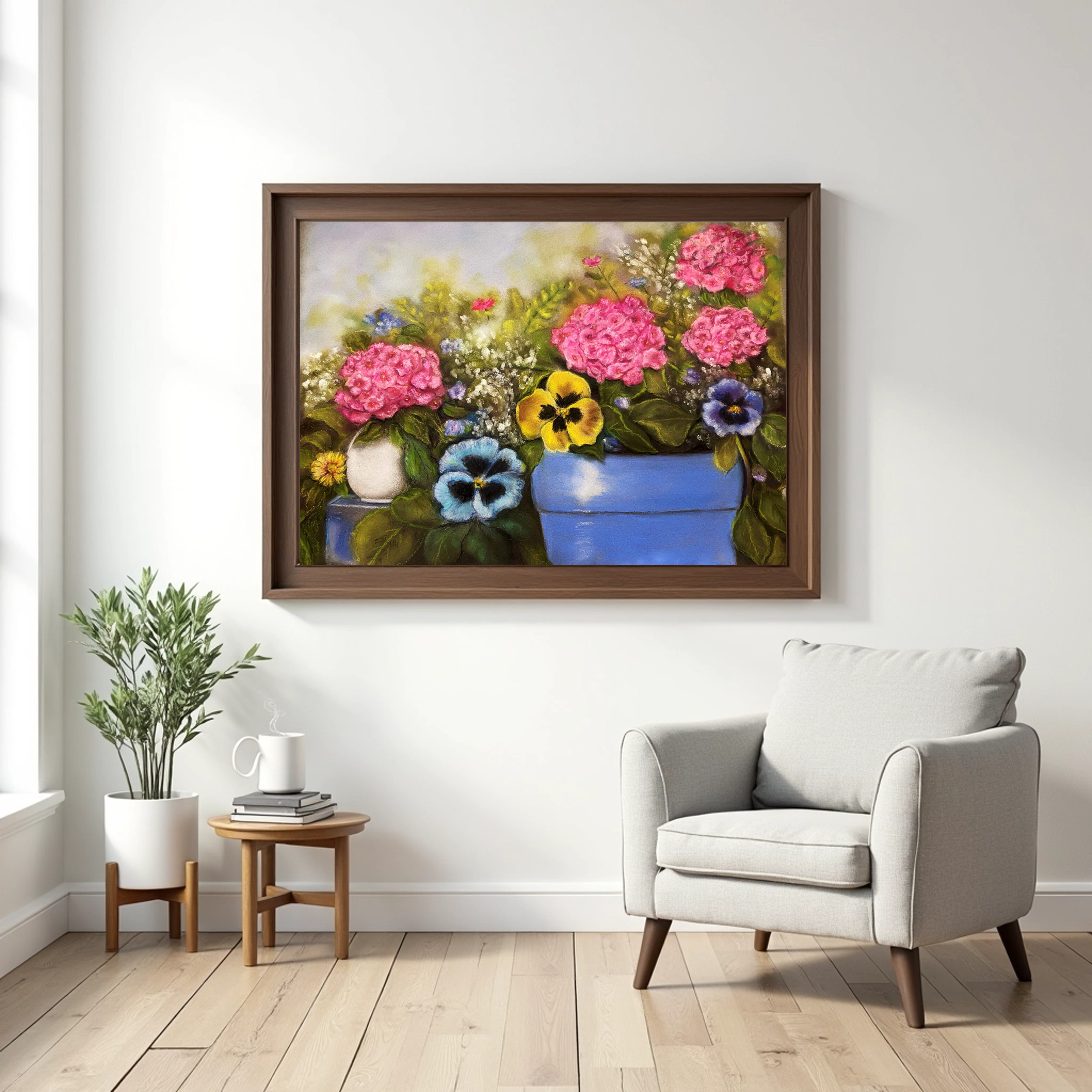
Once I complete a painting in this medium, it's ready to be framed. I no longer use a soft chalk fixative because it darkens the painting. I keep them safe by blotting them with a newspaper print paper. Then I preserve them in a frame or cover them with glassine paper on the painted side for shipping.